Major increase in Torontonians biking to work: up to 34% in some neighbourhoods
Cycle to work rates are up city-wide
If you were to pause along any downtown cycling route - say, St. George, College, Harbord, Bloor - during morning rush-hour, you’d probably notice that the majority of people are travelling on foot, by bicycle, or by transit, and that people travelling by car are in the minority. The latest data from the 2016 census reveals that, in fact, rates of cycling to work* are up city-wide, and there are pockets both in the core and in suburban neighbourhoods where these rates have increased dramatically.
*These rates reflect the percentage of long-form census respondents who listed cycling as their main mode of transportation to work.
Comparing 2016 to 2006 data: evidence of significant growth both across the city and at the neighbourhood level in the core
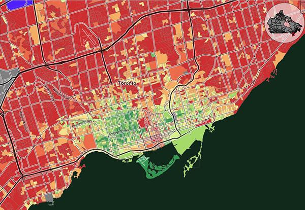
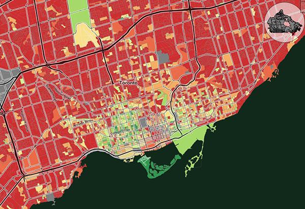
It is valuable to take a look at screenshot comparisons between 2006 and 2016, given those two maps draw from the long form census (which was eliminated for the 2011 census).
Cycle to work mode share: 2016, 2006 (CensusMapper); Legend = % of the population that list cycling as their main mode of transportation to work
Cycling mode share as high as 34% in some neighbourhoods
Across the city core we’re consistently seeing cycling mode shares of 15 - 25%, but if we zoom in to the Dissemination Area (DA) level, numbers go as high as 33% in areas like the Annex, Trinity-Bellwoods, and Cabbagetown. These are areas where we have observed high numbers of cyclists riding throughout the year during morning and evening rush hour, but having the census data to back up this anecdotal evidence is powerful.
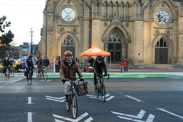
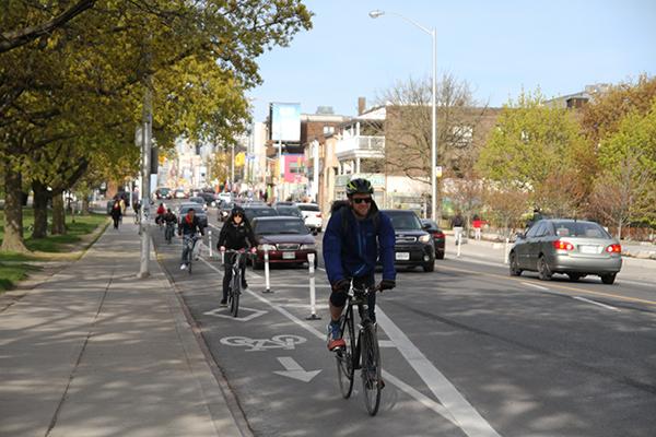
Crossing Bathurst St at Adelaide St W (Photo: David Keough)
Drilling down to the neighbourhood level, the following have cycling mode shares far exceeding the 20% threshold (shown as dark green in the maps). These are incredibly high numbers - though they should be taken in the context of very small sample sizes given the unit of measurement is Dissemination area (often with a population <1,000 except in the densest parts of the city).
People are cycling to work in pockets outside of the core
We should also look at neighbourhoods outside of the core that have seen growth in cycling mode share, such as:
Riding on the Tour de Central Scarborough (Photo: Toronto Centre for Active Transportation)
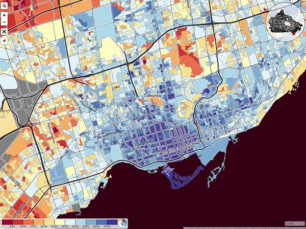
Not only are we seeing increases in these pockets, but rates of active modes (which includes walking and cycling) across the city appear to be growing - though unfortunately, there is no corresponding map from the 2006 census. A cursory look at the 2016 map, below, showing the proportion of the commuting population that takes active transportation to work reveals that rates consistently exceed 70% - not only in the core, but well into parts of North York and Scarborough.
Active Transportation to Work (walking, cycling, taking transit), 2016 (CensusMapper)
Where are we seeing overall growth?
Looking at where growth in cycling mode share has occurred, it appears as though the bulk of the growth is concentrated in the Toronto East York district with some of the neighbouring wards (e.g. 5, 6, 13, 16, 17, 25, 36) having large pockets in excess of 10% mode share. While the geographic unit used by StatCan is Dissemination Areas (DAs), rather than wards, if we were to overlay a ward map (stay tuned for this map!), we would see that the highest cycle mode share is found in wards 14, 18, 19, and 20, which are all in excess of 10%.
What does the new data tell us? Build it and they will come.
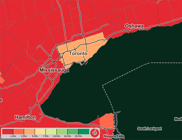
These data are telling an important story that is not always captured when reporting on city-wide averages in cycling mode share (see map below). The media often use an aggregated approach to report on cycling number, which mask the skyrocketing percentages of people cycling in the core. When we compare the fine-grain data revealed in these StatsCan maps to city-wide numbers of 2.7% (up from 1.7% in 2006), it’s clear that there is huge variability between neighbourhoods.
City-wide rate of biking to work hides much higher numbers observed in neighbourhoods (Map created by Herb van den Dool based on 2016 Statistics Canada data, using CensusMapper tool)
We believe there is a set of push-pull factors that explain why more people are riding more often.
- Convenience: More than 50% of all trips in Toronto are less than 5 km in length which are considered easily bikeable.
- Freedom: Driving a car and taking transit during rush hour can be frustrating (to put it lightly) whereas cycling offers convenience, reliable travel times, health benefits, and a sense of freedom and joy compelling more people to switch to cycling.
- Predictability: Counter to the narrative that cycling is only viable in the core, there is evidence that people across the city are choosing to cycle - especially noteworthy in parts of the city with unreliable transit service.
What’s missing, however, is a safe network of high quality protected bike lanes and low speed residential routes. Toronto’s 10-year Cycling Network Plan (CNP) includes a proposed minimum grid network of protected bike lanes on main streets, low speed bikeways on quiet streets and multi-use trails. The CNP was approved by Toronto City Council in June 2016; however, consideration of all new Major Corridor Studies for protected bike lanes on main streets was deferred until after the 2018 election.
The City’s network of protected bike lanes is small and largely limited to the downtown core where we see the largest uptake of cycling mode share. We need to accelerate the Major Corridor Studies in the CNP to enable more Torontonians to ride more often and extend the benefits of cycling city-wide.
We can’t overstate that cycling infrastructure needs to keep up with demand in order to protect vulnerable road users as cycling mode share continues to increase.
.
.
.
A huge thank you to our Advocacy Committee for their insights and contributions to this piece.
NOTE: 2016 and 2006 statistics reflect the percentage of the population that list cycling as their primary mode of transportation to work. In other words, these data do not necessarily capture people who cycle to transit or for other purposes than commuting - the numbers could be even higher!
Read more
Census 2016: Spike in number of Canadians cycling, taking public transit to work (Oliver Moore, Globe and Mail)
Share of Torontonians taking public transit is on the rise, while reliance on cars declines (Ben Spurr, Toronto Star)
Toronto has the longest commutes in Canada. How does your commute compare? (Leslie Young, Global News)

